Using Color to Transform Spaces Enhance Visual Optimization
The Role and Influence of Color in Various Environments
Color is not merely an aesthetic choice; it is a powerful design element that affects our experiences and surroundings in meaningful ways. It plays a critical role in shaping how we perceive spaces, influencing our emotions and behaviors while also serving functional purposes. By understanding how color can be harnessed effectively, designers can significantly enhance the quality of life within a given environment.
Emotional Impact of Color
The emotional resonance of colors is profound. For instance, studies have shown that blue shades often evoke feelings of tranquility and communication. This is why many corporate offices opt for blue accents in their design. In contrast, vibrant red can stimulate energy and urgency, making it a popular choice in dining areas and fast-food locations where a lively atmosphere is essential for encouraging patrons to engage and consume quickly. Similarly, green is associated with nature and relaxation, which makes it ideal for healthcare facilities aiming to create a soothing experience for patients.
Spatial Perception and Color Choices
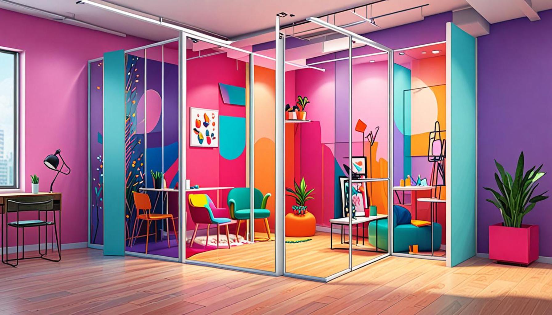
Color also plays a critical role in the perception of space. A room painted in deep hues may feel more intimate but can also create a sense of confinement. For example, navy blue can work well in a home office to create a conducive workspace but may make the room feel smaller if not accented with lighter colors. On the other hand, using light pastels, such as soft yellows or pale blues, can expand the perceived size of a room, inviting in a sense of openness and airiness. This is especially useful in small apartments common in urban environments of the United States.
Brand Recognition and Color Psychology
Color’s impact extends beyond emotional responses to branding as well. Research indicates that up to 90% of snap judgments regarding products can be influenced by their color. For instance, brands like Coca-Cola utilize red for urgency and appeal, while tech companies often gravitate toward blue shades for their associations with reliability and trustworthiness. Such psychological underpinnings underscore the necessity for businesses to adopt color schemes that resonate with their target demographic, as this can lead to improved brand recognition and customer loyalty.
Maximizing Visual Potential
As we further explore the intricate relationship between color and visual optimization, it becomes evident that every decision made regarding color choice impacts not just the aesthetic appeal but also the functionality of a space. Whether it’s enhancing productivity in a corporate setting with warm tones or creating a calming retreat in a residential area, recognizing the implications of color allows for well-thought-out design that reflects both purpose and emotion. This dynamic journey through color holds the potential to transform overlooked spaces into environments that truly resonate with our daily needs and experiences.
In conclusion, the power of color in design extends beyond simple preference; it is intertwined with emotional experiences, spatial dynamics, and brand identity. By utilizing color strategically, we can create environments that are not only visually pleasing but ultimately enhance our overall well-being.
CHECK OUT: Click here to explore more
Harnessing Color for Enhanced Functionality and Aesthetic Appeal
The strategic use of color can transform ordinary environments into vibrant spaces that not only enhance aesthetic appeal but also optimize functionality. This process of visual optimization goes beyond mere decoration; it involves understanding how different hues interact with light, space, and human psychology. Whether it is in residential interiors, corporate offices, or public spaces, the right color choices can greatly impact both the mood of the environment and the behavior of its occupants.
Creating Functional Spaces with Color
In the realm of interior design, color serves as a vital tool for creating not just beautiful, but also functional spaces. Research has shown that specific colors can enhance cognitive performance and productivity, making them crucial for environments such as workplaces or educational institutions. Consider the following applications:
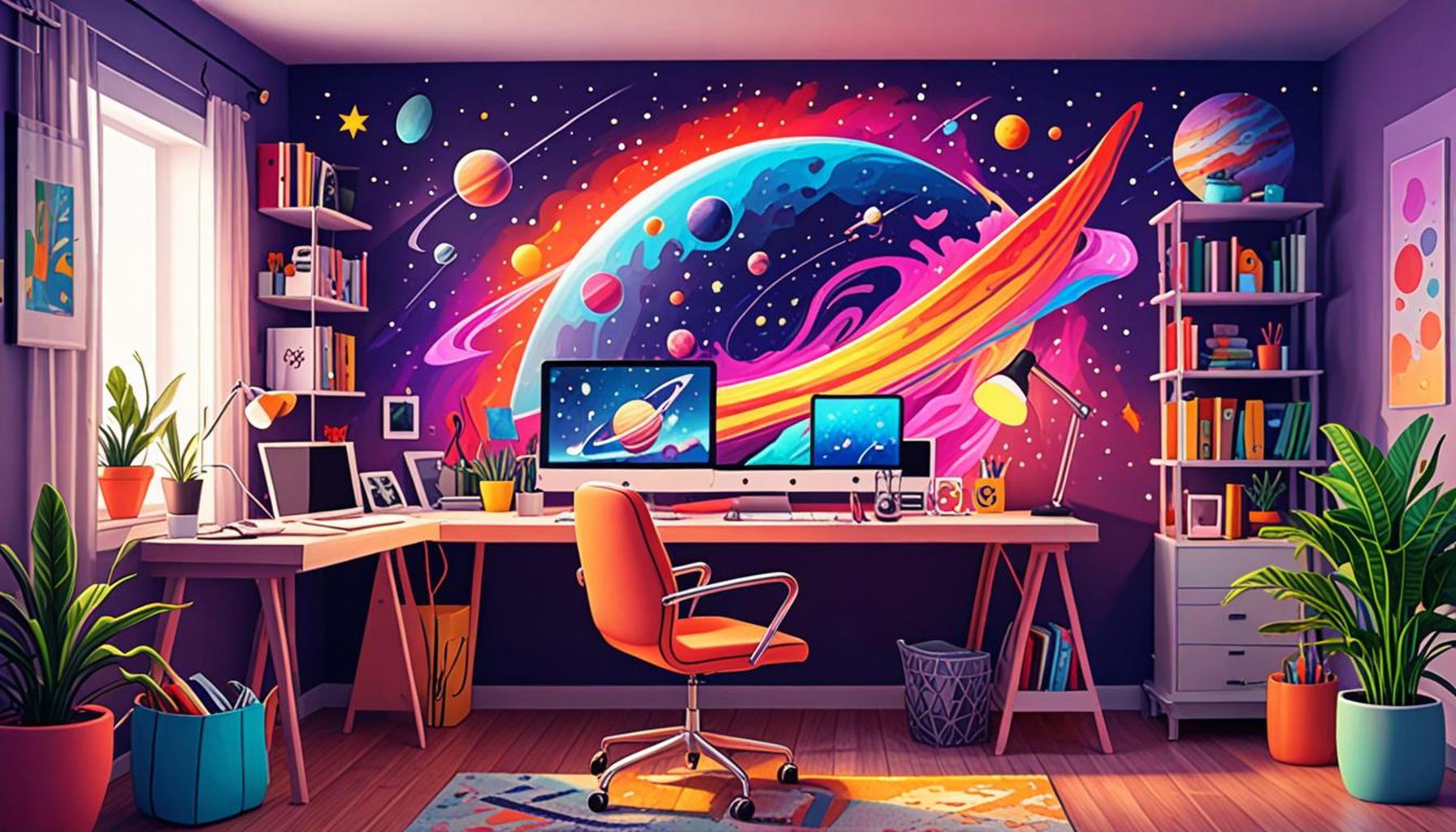
- Blue: Often used in offices, blue is known to foster concentration and mental clarity. Many tech companies in Silicon Valley incorporate various shades of blue in their designs to promote innovation and focus.
- Yellow: This cheerful color is effective in stimulating creative thinking. It is often utilized in collaborative spaces, such as brainstorming rooms or art studios, to encourage brainstorming and idea generation.
- Earthy Tones: Colors like terracotta and olive green provide a sense of grounding and stability, ideal for spaces meant for relaxation, such as living rooms or wellness centers.
Furthermore, the use of color can help delineate different zones within a space, enhancing usability. For instance, a kitchen painted in warm yellows and reds can create a lively cooking atmosphere, while serene greens and blues in a bedroom can promote restful sleep.
Color and Cultural Context
Understanding the cultural significance of color is essential for effective design. In the United States, colors carry different meanings and associations that can be leveraged in various contexts. For example, orange is often linked with enthusiasm and creativity, making it popular in children’s play areas or educational centers. Conversely, black can evoke sophistication or formality, frequently appearing in upscale restaurants or corporate branding.
Designers must also be mindful of how color resonates with the diverse demographics within the U.S. By conducting thorough research into cultural meanings and preferences, designers can create spaces that are not only visually striking but also culturally sensitive and inclusive.
Practical Considerations for Implementation
As with any design element, practical considerations must be taken into account when implementing color strategies. This includes the following:
- Lighting: The way light interacts with color can vary dramatically throughout the day. Natural light can enhance certain shades while dim artificial light can mute them. Testing color samples under different light conditions is essential.
- Complementary Colors: Utilizing color wheels can assist designers in selecting complementary shades that work harmoniously together, enriching the overall visual experience.
- Maintain Balance: Overuse of bold colors can overwhelm a space. The key is to find balance by incorporating neutral tones, which can anchor stronger hues and prevent visual chaos.
In summary, the deliberate use of color is an integral aspect of transforming spaces to enhance visual optimization. By carefully selecting colors based on their functional, emotional, and cultural implications, designers can create environments that support human activity, influence moods, and ultimately elevate the quality of life.
| Advantage | Description |
|---|---|
| Increased Mood and Productivity | Colors can evoke emotions, enhancing productivity and creativity in workspaces. |
| Enhanced Space Perception | Strategic color usage can make small areas appear larger and more inviting, optimizing layouts. |
Embracing the concept of Using Color to Transform Spaces Enhance Visual Optimization opens new avenues for architects, interior designers, and home enthusiasts alike. The psychological impact of colors on human behavior plays a fundamental role in design strategies aimed at fostering positive environments. For instance, hues like blue and green are known to promote a sense of calm and tranquility, making them perfect for offices and study rooms.Furthermore, the significance of light in conjunction with color should not be overlooked. Natural and artificial lighting can drastically alter how these colors are perceived, creating a dynamic interplay that enhances aesthetic appeal. The use of color gradients and accents also contributes to guiding the viewer’s eye, helping navigate through spaces intuitively. Ultimately, understanding the science behind color and its impact can transform not only the look of a space but also its efficacy, encouraging innovation in design practices.
SEE ALSO: Click here to read another article
Color Psychology: The Neuroscience of Color in Design
Delving deeper into how color influences human behavior reveals fascinating insights from the field of neuroscience. As scientists explore the psychological effects of color, it becomes evident that distinct colors can elicit specific emotional responses, directly affecting our perception of space. For example, research highlights that certain hues can stimulate the brain, boost energy levels, and even influence heart rate.
Impact of Color on Mood and Behavior
Understanding color psychology is vital for architects and designers aiming to optimize spaces. For instance, a study conducted by the Institute for Color Research found that people make a subconscious judgment about an environment within 90 seconds, and as much as 62 to 90 percent of that assessment is based solely on color. The implications are clear: the right color scheme can turn a lackluster environment into a dynamic center for productivity and creativity.
Consider the following colors and their emotional impacts:
- Red: Associated with energy and urgency, red can stimulate appetite and increase heart rates. This makes it a popular choice in restaurants and cafes, designed to encourage customers to eat quickly and leave room for more diners.
- Green: Symbolizing tranquility and health, green is ideal for spaces focused on well-being, such as spas and medical offices. Its calming effects can lower anxiety, making patients feel more comfortable.
- White: Often linked with cleanliness and simplicity, white can create a sense of spaciousness. Its minimalist appeal is favored in modern design, allowing other elements to stand out and define the space.
Color in Branding and Marketing
In the bustling world of branding and marketing, color is a critical factor that can dictate consumer perception and buying patterns. Leading brands use color strategically, recognizing its power to attract attention and convey brand personality. For instance, McDonald’s, with its iconic red and yellow palette, creates a sense of urgency paired with a warm, friendly vibe that resonates with families.
Furthermore, research indicates that up to 85% of consumers base their purchase decisions on color alone. Companies like Apple employ simple color schemes in their product designs to evoke feelings of elegance and innovation; a tactic that helps differentiate their products in a saturated market. By considering color theory during branding efforts, businesses can effectively enhance their appeal and engage their target audience.
Color Trends and Sustainability in Modern Design
As societal values shift towards sustainability, color choices are also evolving in response to environmentally conscious designs. Contemporary designers increasingly favor colors inspired by nature, reflecting a movement towards sustainability. Biophilic design, which incorporates elements of nature, integrates warm earth tones and greens to create harmonious spaces, which not only optimize visual appeal but also promote ecological awareness.
This trend is exemplified by the rising popularity of colors such as sage green and terracotta, both evoking a sense of connection to the earth. As urban environments grow, the push for incorporating natural elements through color becomes essential for both psychological well-being and aesthetic cohesion.
The field of color in design is ever-evolving, driven by intricate layers of psychology, culture, and consumer behavior. Harnessing color effectively allows designers to create spaces that are not only visually stunning but also enrich the human experience. This ongoing transformation underlines the essential role color plays in shaping our environments, making visual optimization a contemporary necessity.
CHECK OUT: Click here to explore more
Conclusion: The Transformative Power of Color in Design
In the realm of design, the strategic use of color emerges as a powerful tool for transforming spaces and enhancing visual optimization. By tapping into the psychological effects of color, architects and designers can create environments that resonate deeply with occupants, evoking emotions that influence moods and behaviors. As demonstrated, colors such as red, green, and white not only alter our perception of space but also strategically guide our responses within those spaces.
The profound impact of color extends beyond mere aesthetics; it plays a crucial role in branding, where companies leverage color to shape consumer perceptions and drive purchasing decisions. With an astounding 85% of consumers relying on color to inform their choices, the stakes are high for businesses aiming to create a strong visual identity. Moreover, the shift towards sustainability in design, characterized by an affinity for natural hues, demonstrates a growing recognition of color’s ability to connect individuals to their environment, fostering a sense of well-being and ecological awareness.
As we move forward in an increasingly visual world, the importance of thoughtful, informed color choices cannot be overstated. For designers and consumers alike, embracing the science of color can unlock the potential to redefine environments—ultimately leading to spaces that are not only aesthetically pleasing but also conducive to productivity, creativity, and emotional well-being. The exploration into color as a transformative element in design invites us to reconsider our surroundings, inspiring a deeper appreciation for how color shapes our daily experiences.